Why everything is tonal.
Walk into any shop and you'll find two flavours of branding: shouted, or absent. The shouted version puts a wordmark across the chest and asks the wearer to do unpaid advertising. The absent version drops the mark entirely and ends up looking like every other unbranded basic on the shelf.
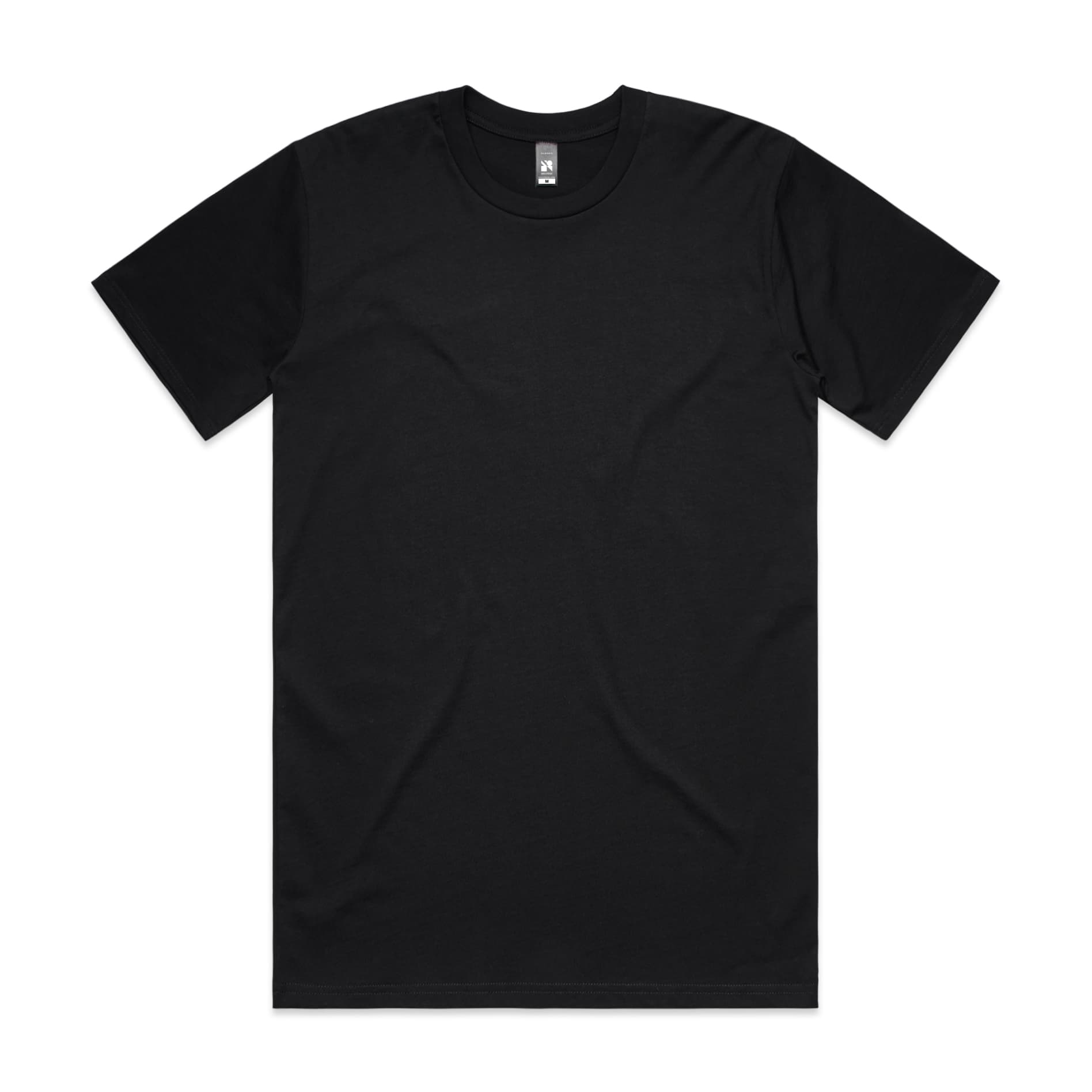
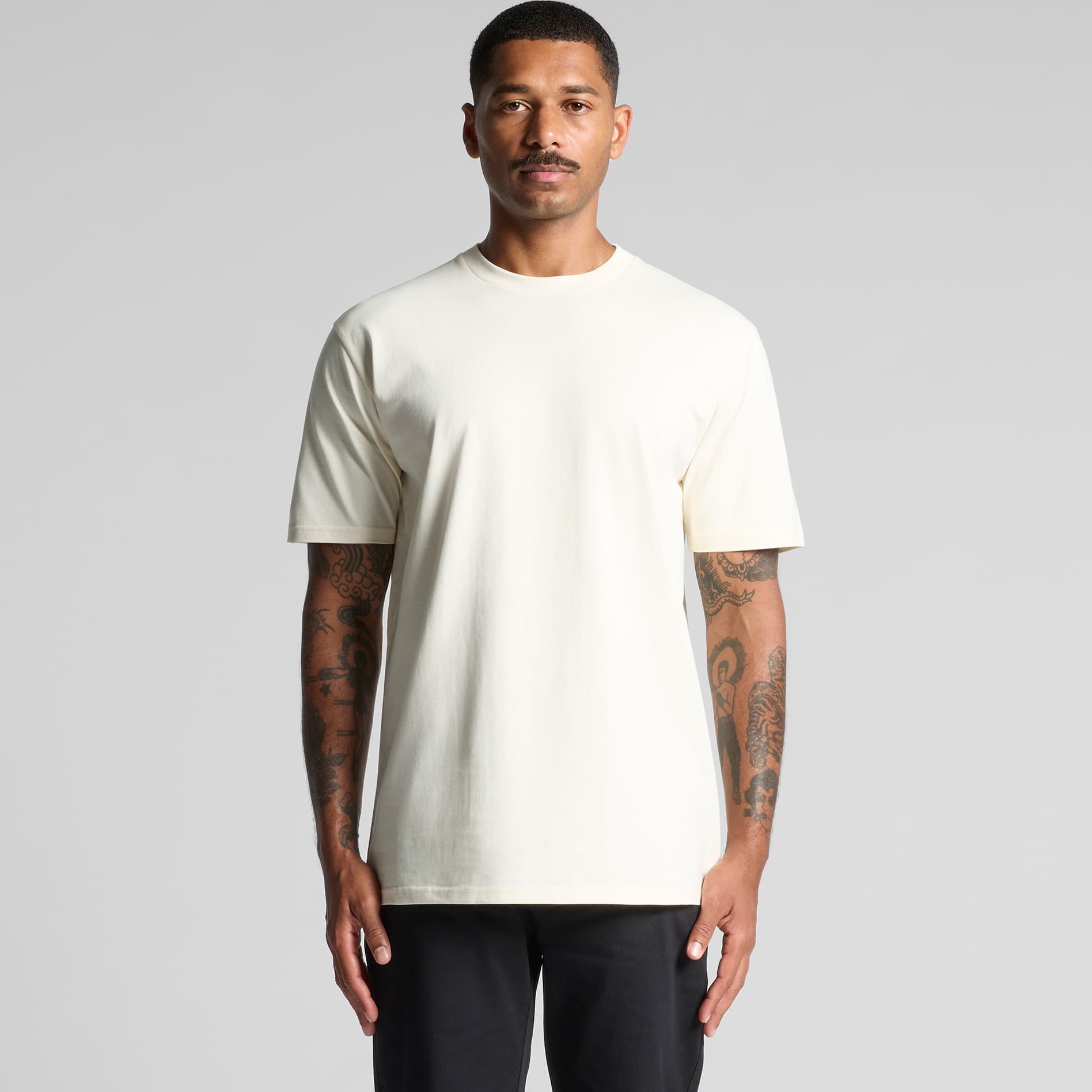
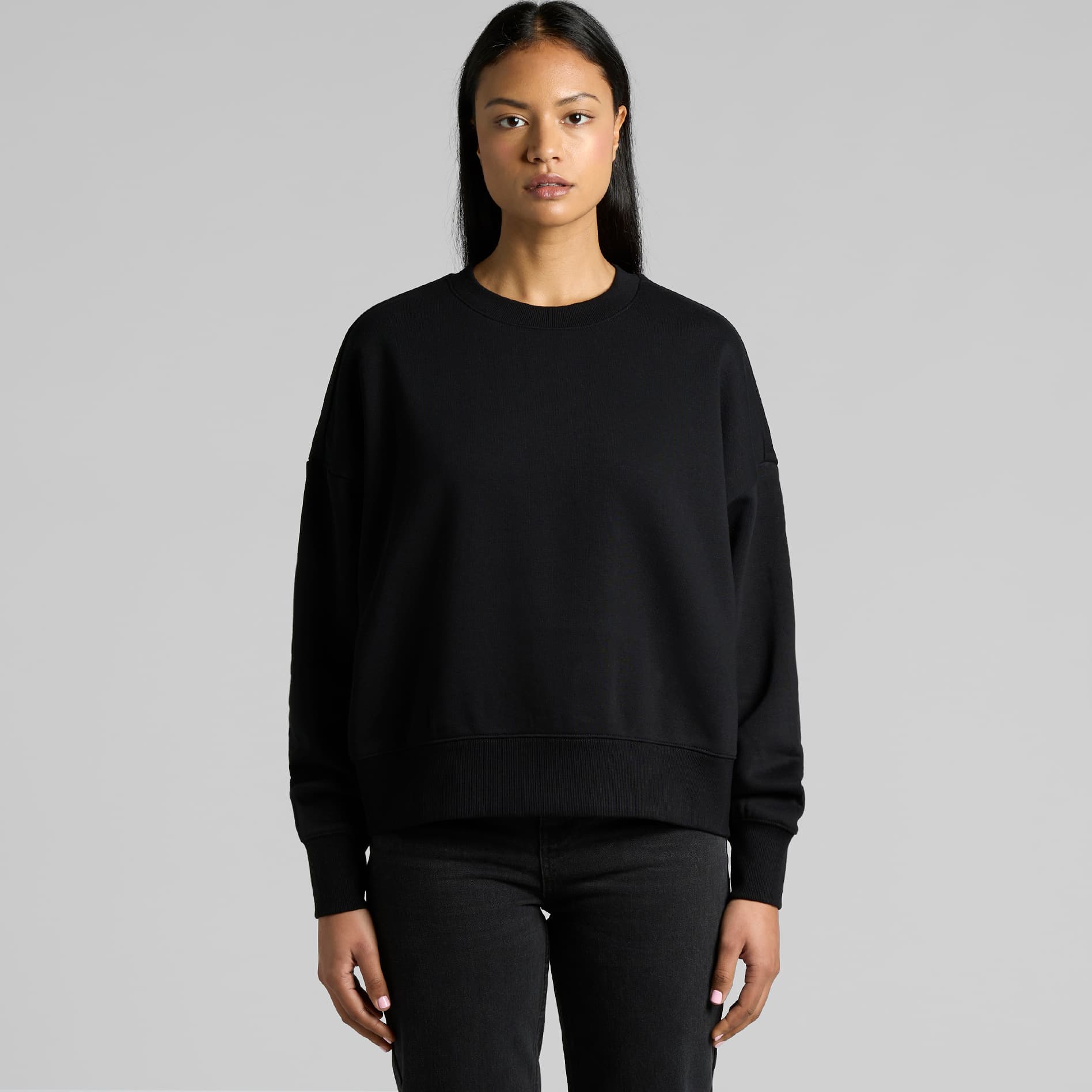
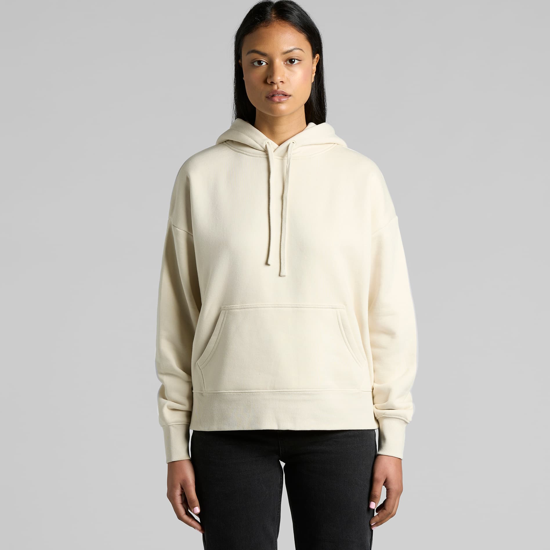
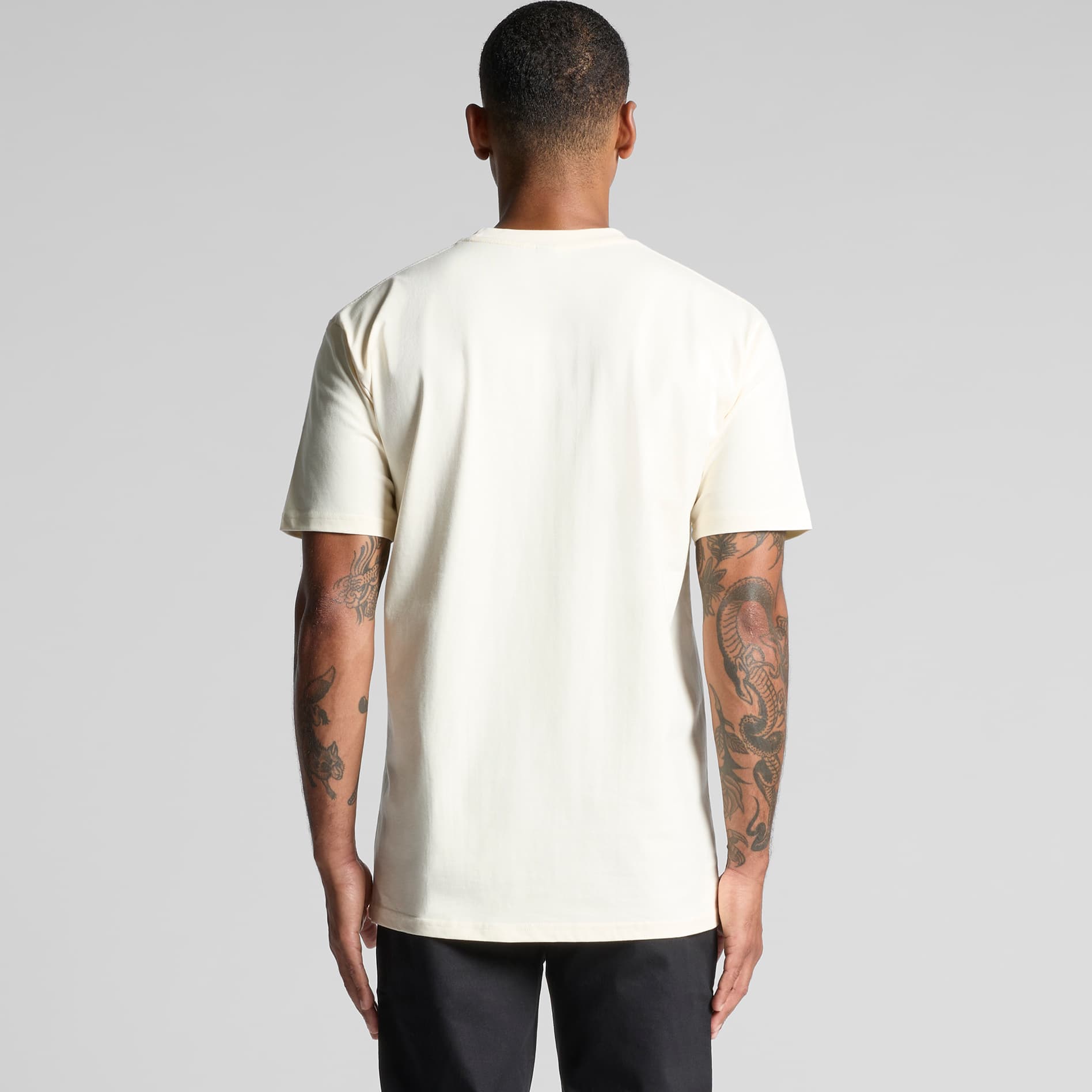
We wanted a third option. Embroidered, because thread holds up where print cracks. Tonal — same colour family as the garment — so it reads as finishing rather than branding. Front chest and back, so the geometry is balanced. Close enough to see when you're looking; quiet enough to ignore when you're not.
Restraint as a design choice
Restraint is harder than it looks. Adding a logo is easy. Picking the right thread tone, on the right substrate, in the right position, at the right scale — that takes a dozen samples. Most of the work on each piece happens at that level. The visible part is the part nobody notices.
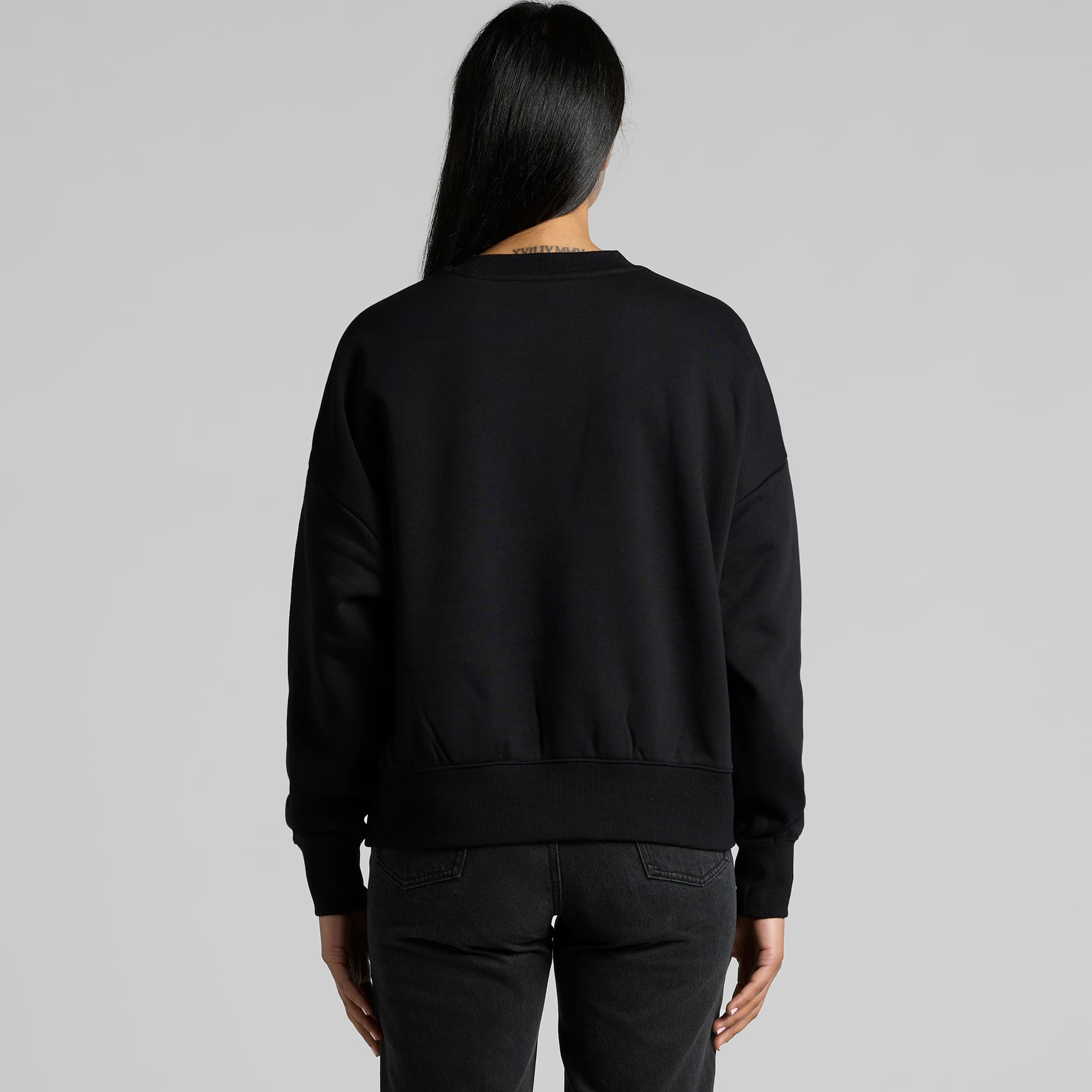
“Close enough to see when you're looking; quiet enough to ignore when you're not.”